Food Oasis-For food seekers
Increased new user visits by 34% by redesigning how food seekers see hours and availability, and 70% users who could correctly identify open/closed status within 5 seconds

Overview
Food Oasis was created to connect Los Angeles residents with local food resources during a period of increasing food insecurity.
Challenge
The site looked functional — but it was quietly lying to hungry people about when they could eat. A pantry showing "Open 11:30am–8:00pm" looked open every day of the week. In reality, those hours only applied on Mondays. For someone deciding whether it was worth the trip, that ambiguity wasn't a UI nitpick — it meant wasted time, or worse, showing up to a closed door.
Original site issues
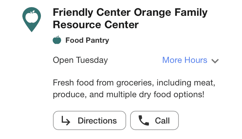

Default view can be misleading — missing hours
Open 11:30 am–8:00 pm’ looks like the hours apply every day, but they only apply to Monday.

Same hour display everyday
Users wanted to see more operating hours without needing to expand the schedule.
Here's How I Got There
Interviews
User interviews with 11 potential food seekers, a mix of aged group that from 18- 70 years old that focus on schedule and the feeling of text display related to time.
Surveys
5 people
wanted a countdown to closing time built into the display, not just a start/end time
3 people
reported that arriving 1–2 hours before closing often meant fewer fresh food options were available.
2 people
found fewer packaged goods available when visiting later in the week.
Key findings
After interviewing users and testing the app and website with five participants, I wondered:
How can we improve the date and time display so food seekers can understand their schedules at a glance?
What do food seekers need to know at a glance?
Solution First
Closing soon

Before
Users recognize the open tag but also need today's date and remaining hours before closing to know if they can arrive in time.

After
Displayed remaining time as “X hours Y minutes” to help users decide if they can arrive before closing
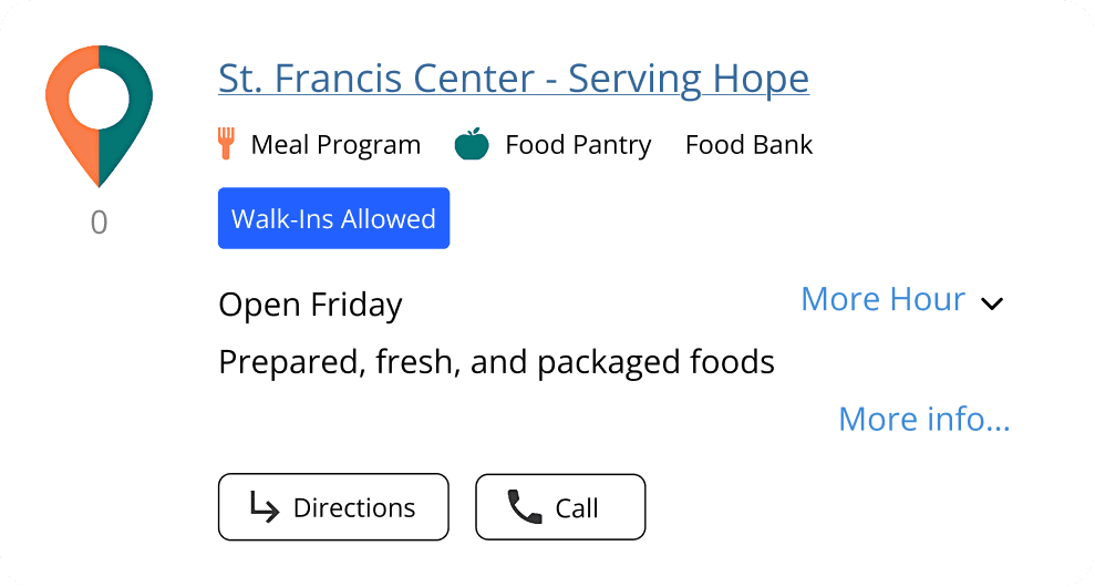
Before
Missing a closed status, date, and weekday, making reopening times unclear.
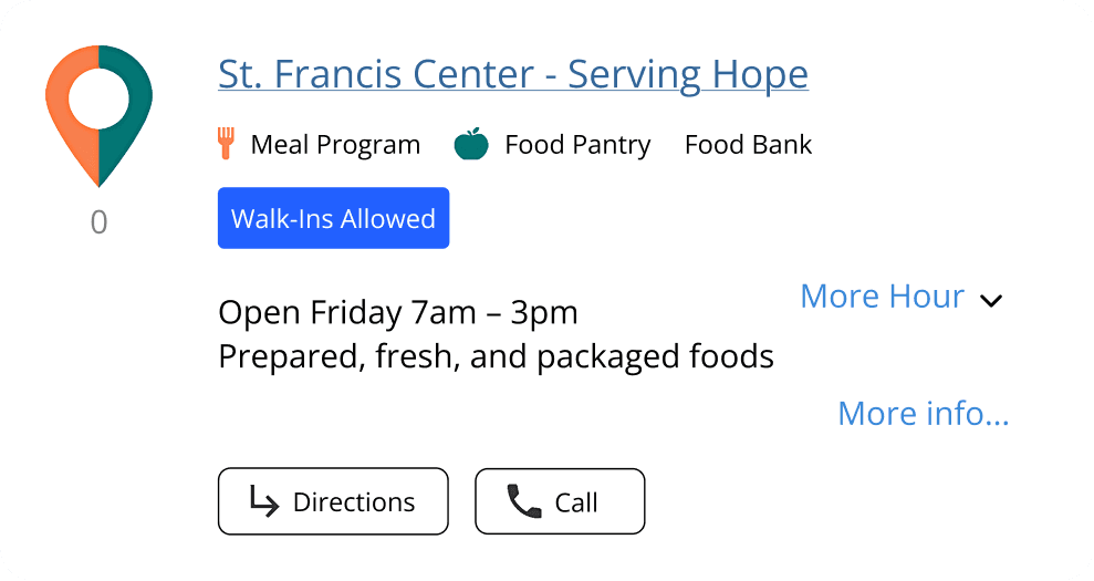
After
Added next open time (“X AM–X PM”) to help users plan their visit.
Monthly scheduled

Before
Users cannot determine which Friday to visit due to unclear date information.

After
Displayed “X days from now” to help users understand the next available date
Feedbacks
After question, I created different mockups and post in FOLA-RESEARCH Slack team. Here's some examples.

Before

After- Add shedule
"Maybe show “Open tomorrow (Fri) 7–11am” with the day and closing time. I sometimes forget what day it is, and the ending time may be especially useful for food-seekers because food programs often have short hours." - Bryan Wu
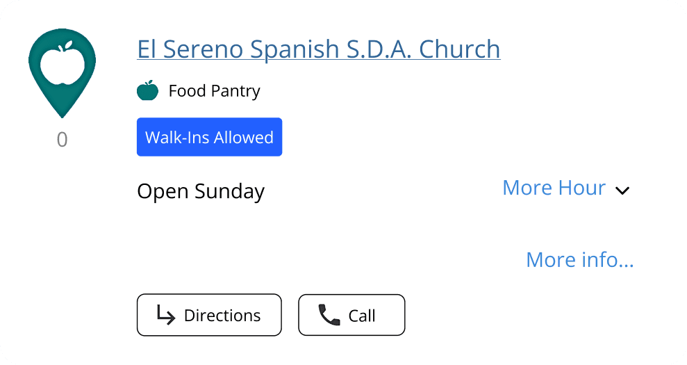
Before

After- add how many day left
This might be too much information. If it already says “Open Sunday,” that may be enough. - Jelena Karanovic
Why I chose the final Design
Food seekers can easily see when food pantries are open or closing today, along with the next available opening time through a simple countdown system. The card is designed with minimal, non-redundant text, making it easy to scan at a glance. This allows users to quickly understand whether a pantry is open today and view key hours directly on the card without needing to expand it.
Impacts
+34%
70%
What I learn
The most important thing I learned didn't come from a chart — it came from listening. While I was focused on fixing hour-display logic, several participants told me they weren't just coming to food pantries for food. Some seniors came specifically to socialize, and would linger even after picking up what they needed. Others, especially students, wanted to get in and out quickly.
That distinction reframed the design problem: "quick and clear" wasn't just a UX best practice, it was serving two genuinely different needs — efficiency for some, connection for others. It's part of why the countdown system prioritizes speed and scannability by default, while leaving room to explore more (via "More info") for people who want it.
The tactical lesson: users need quick, unambiguous information about whether a pantry is open and when it opens or closes next. Detailed, expandable information is secondary. When collecting feedback, I also learned to weigh not just what people said, but whether it was actually relevant to the problem I was solving — several opinions in testing were valid but out of scope, and part of the work was knowing what to leave out.